
Morphosis
MORPH • BLEED • REPEAT
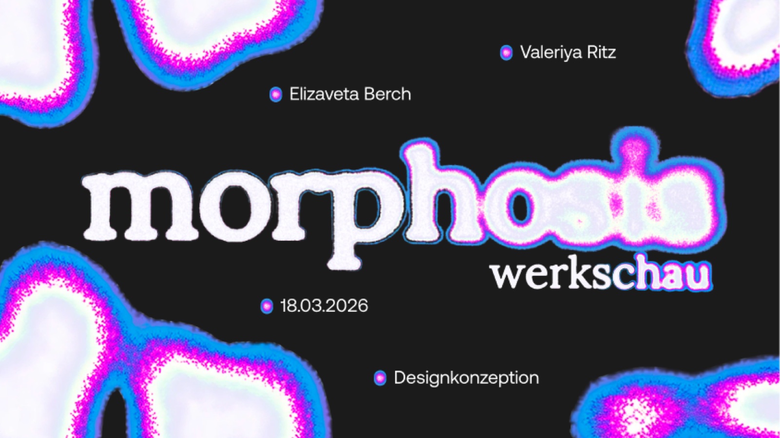
The visual identity for the Werkschau 2026 — a design system built on transformation: organic forms, thermal ink-bleed and a name that morphed itself into place.
The Concept
Metamorphose became Morphose became Morph became Morphosis — the naming already did what the identity promises. Nothing here is fixed; everything is mid-transformation.
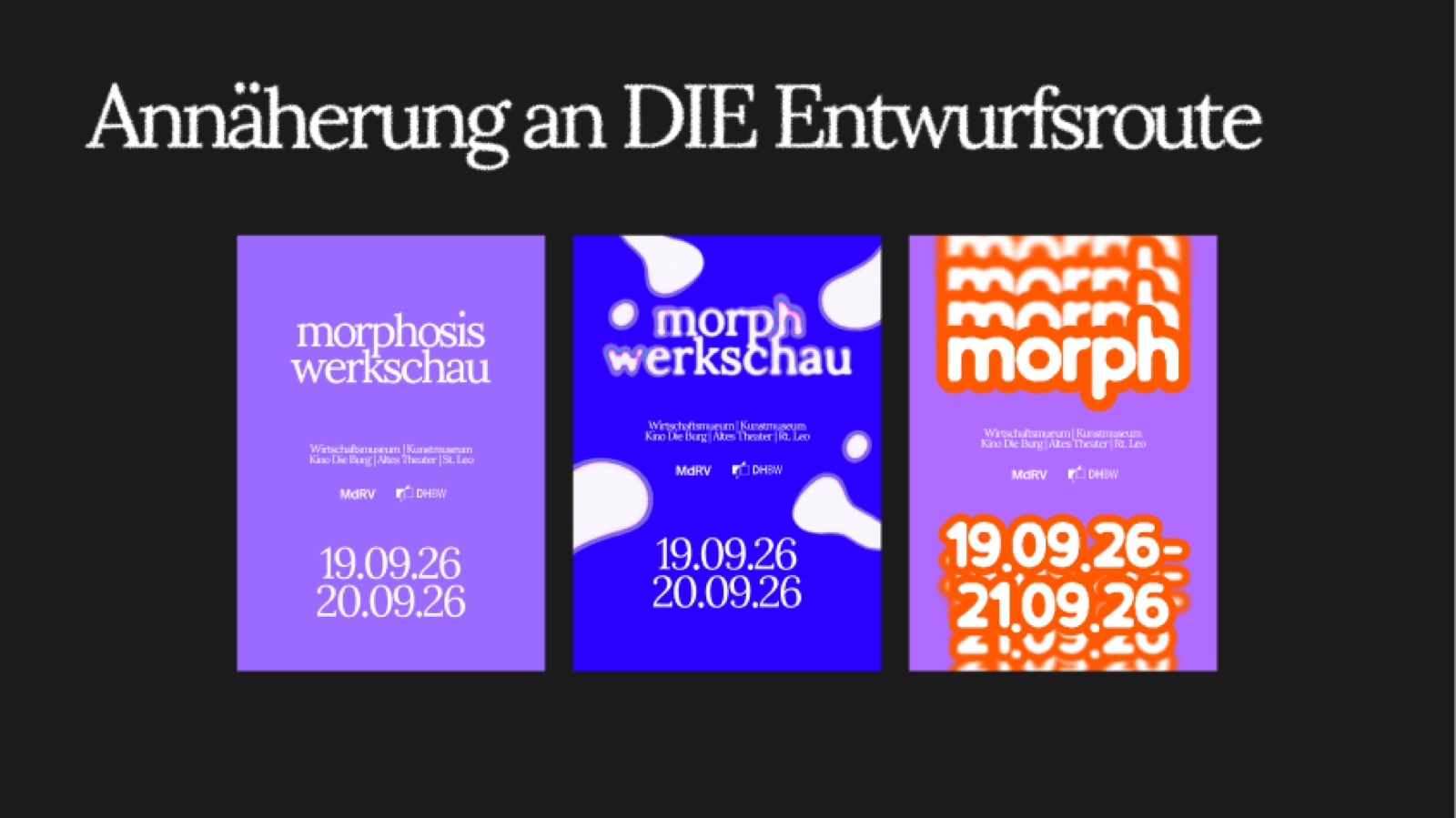
The System
Organic shapes, a thermal ink-bleed effect and typographic contrast form a system that never repeats itself: every poster mutates, yet everything stays unmistakably morphosis.
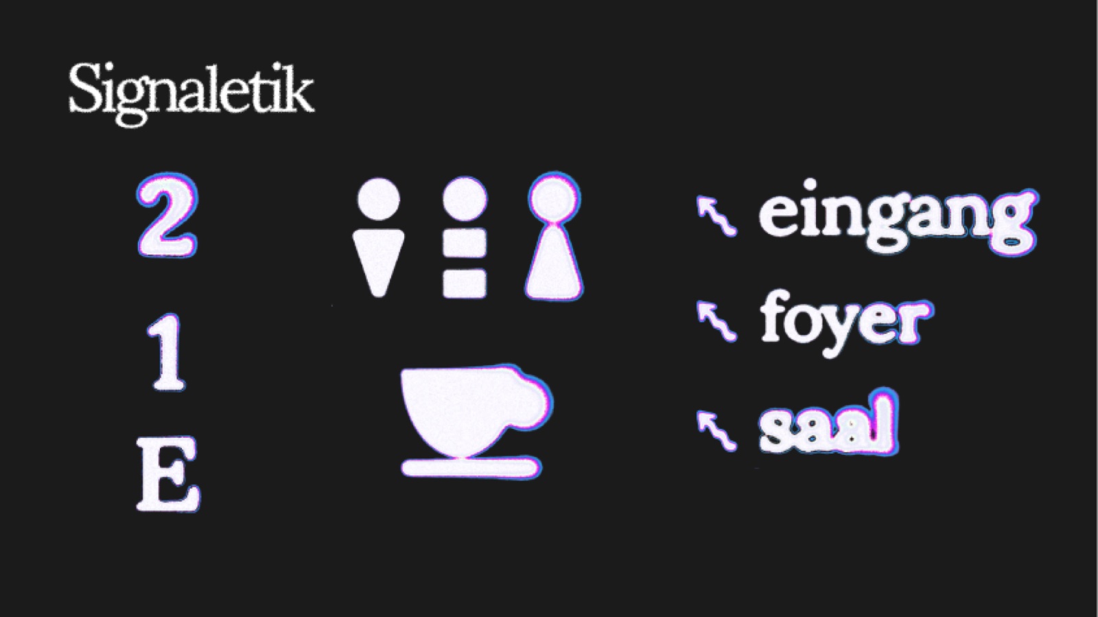
The Exhibition
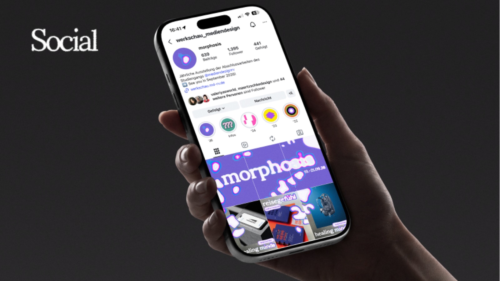
Applied across the venue and beyond — signage guiding through entrance, foyer and hall, a social presence and a landing page that make the transformation walkable, scrollable, visitable.
Valeriya Ritz · Elizaveta Berch